Sunday, June 24, 2012
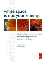
Review of WHITE SPACE IS NOT YOUR ENEMY by Kim Golombisky & Rebecca Regen
Photo Credit: Focal Press
Who the book is for: Anyone interested in learning multimedia design
Rating: 5 out of 5
WHITE SPACE IS NOT YOUR ENEMY by Kim Golombisky and Rebecca Regen is beginner’s guide that covers all the basics of communicating visually through graphic design. Whether you’re putting together a brochure, a newsletter, or a website, this book introduces you to the foundational concepts that will have you designing quickly.
I don’t have a background in design. I’ve put together a few things like flyers and basic websites before. This book is great because it walks a beginner through some very foundational concepts in a concise and clear manner. The authors point out some common mistakes that beginning designers makes, mistakes I know I’ve made on several occasions. The “works-everytime-layout” is perfect for putting together quick informational flyers. The Mini Art School is really helpful, as well as the chapters on grids, color, type, and using photos. I especially liked the chapter on storyboarding because I love visual storytelling.
If you’re interested in graphic and multimedia design, WHITE SPACE IS NOT YOUR ENEMY is a great place to start. I can’t wait to put some of the things I’ve learned from it into practice.
I received this book for free for review from Focal Press, and the opinions contained in this review are completely my own
Labels:
Nonfiction Review
Subscribe to:
Post Comments (Atom)
No comments:
Post a Comment